
Oxfam Australia
Redesigning Oxfam Australia's Contact Us Page for Enhanced Customer Engagement
Overview : Enhancing the user experience for supporters to create a seamless and intuitive interface that encourages meaningful interactions and effectively addresses their queries and concerns.
Role : UX Researcher, UX Designer, Wireframing
Tools : Figma, Miro, Optimal Workshop, Adobe Illustrator
Context : Via PeakXD
The Problem


Supporters are cancelling
regular donations
Lack of interactive communication
with the supporters (users)
Significant numbers in customer dissatisfaction
Business Goal
Increase retention and acquire new supporters while improving engagement. We want our supporters to be satisfied with the support they receive.
Implement features that encourage active engagement, such as interactive elements and personalized support options.
Target Users
Focused target
group
Primary Users
Regular monthly supporters
Secondary Users
One off donors
Annual Donors
Emergency donors
Others
Students
Media
Potential donors
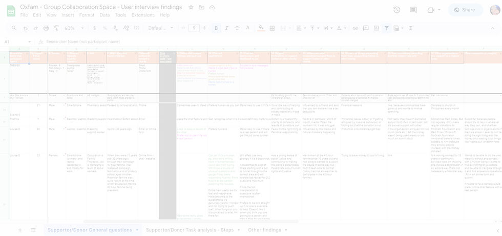
User Interviews and Stories
The project team interviewed and conducted task analysis with about 24 participants who support and give to charities like Oxfam, to understand their motivations, pain points, influences and feelings.
User Interviews and Stories
“As a regular supporter I
want to receive information
about the impacts of the
projects. So that I can feel
confident that my donations
are being used in the right
way in making a difference”


“As a regular supporter I want
to receive emails rather than
calls, and have an option to
call back. So that I can
respond at a time that is
convenient for me”
“As a regular supporter I want
to have my communications
over email. So that I can have
a written record of the
conversation”

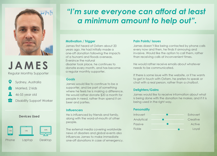
User Persona
Information Architecture
To design a new menu structure for the MyOxfam Portal, an open card sort was done with over 50 participants to see how they would define the categories based on small tasks given to them. Which would help further in designing the Information Architecture for the portal.
Participants came up with four main groups and labelled them as :
Fundraising, Donations, Accounts/ My Details, Communication Preferences
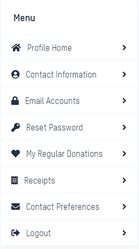
Current My Oxfam Portal
Current IA ( Information Architecture)
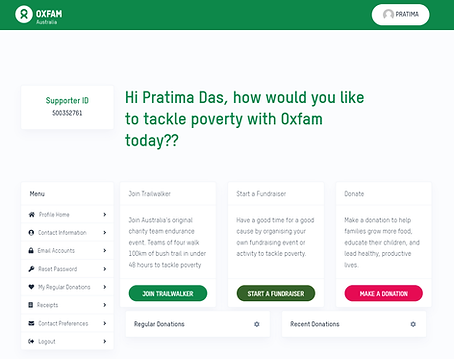
(User's Name)
(User's Name)
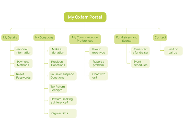
My Proposed Information Architecture
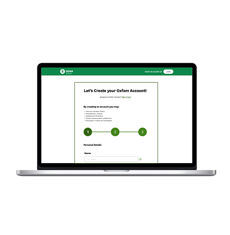
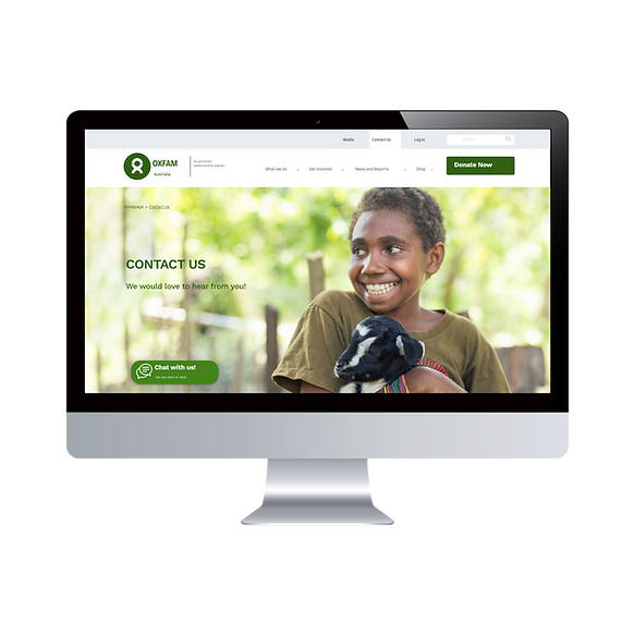
Expert Review of Contact Us Page and Sign Up Page
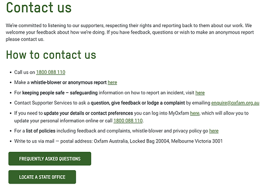
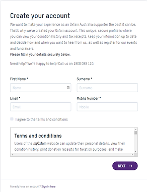
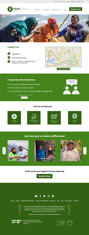
Screenshot of previous Contact Us page
Screenshot of previous Sign Up page
Areas for Improvement
Contact Us Page
Sign Up Page
-
Unclear value proposition with too much text
-
Doesn’t show how many steps needed to finish
-
Incorrect placement of T&C
-
Users not given choice to go ‘back’ or ‘cancel’
-
Text heavy page, which diverts attention
-
There is lack of hierarchy
-
Repetitive use of word ‘here’ for links
-
Too many CTA’s causing friction


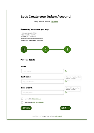
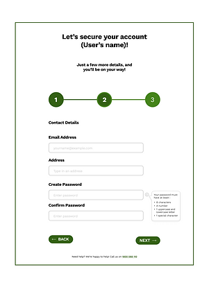
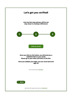
High Fidelity Wireframes
Before starting the designing process, it was important to make some quick sketches to be able to visualize the pages and make iterations accordingly. It was the perfect way to plan out the user experience. After which it became easier to make some High Fidelity Wireframes on Figma, to get user feedback through usability testing sessions.
Sign Up Page Wireframes
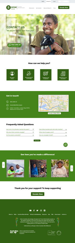
Contact Us Page Wireframe
Same footer as current
Oxfam website
All contact details visible on the
above fold. User has easy and
quick access to different ways of
reaching Oxfam
Links to a few FAQ’s, with the
option to see more if required
Clear tiles for key functions or tasks
Arrows to navigateother slides
Same as current header
Welcome banner with a
friendly tone and an image to
show a human connection
Google map to guide
directions to Oxfam office.
Links to other state office
addresses, if required
Tile slides with image and title, to
show supporters how they have
made a difference
Friendly tone and reminder that
donations are possible from this
button. Users will not have to go
to top of the page to do so
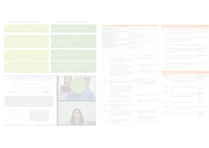
Usability Testing
Before conducting the usability test, a test plan was made, consisting of goal-oriented tasks participants would have to complete. The usability test was done to test the Information Architecture and Wireframes (first click test).
Both the information architecture and wireframes tests had 12 tasks each, that participants were to complete.
The test results were then compared to a successful completion criteria, based on my design.

Every user stayed above the
fold. Scrolling down was an
after thought.
An Unexpected Issue
Key Insights and Findings
What didn't work? :(
What worked? :)
-
Users seem to stay above the fold and take actions based on what they see, without scrolling further down.
-
Layout seemed better laid out , and neater.
-
The ‘chat’ function did not cross the mind of users, they did not look for or think about using chat to resolve any issue
-
Profile icon on top right corner, seems to be the go-to option for majority of the tasks for the users
-
For the Sign Up page, User appreciates the “Already a member? Sign in here”. Makes them feel like they are valued and given the option to login immediately, Keeps in mind the repeat customers.
-
For some users, the page seems like a home-page, so they skim through the page quickly, and don’t notice the ‘contact us’ options
-
“Get involved” option was clear, as it striked out for making donations or getting to know more about the activities Oxfam is participating in.
-
“For the newsletter, I wouldn’t like to go anywhere, it should kind of be very easily available, since all it requires is that I drop my email” .
Revisions to be made
-
Make a clear indication of newsletters - A tile called ‘newsletter’ that indicates the possibility of subscribing to a newsletter.
-
Change the icon for the my Oxfam portal tile to an icon everyone is familiar with, (the person icon). On the header, instead of putting the icon for the profile, I can perhaps add text that says ‘login’ or ‘my Oxfam portal’
-
Make ‘ Contact Us’ section more prominent, and give a heading with bolder larger text reminding the user they are on the contact us page
-
Add sticky chat function for quick action for users
Iterated Design
Sticky chat function
FAQ’s switched to accordians to
quickly get questions answered,
instead of opening several links
Title of the page, so users know
where they are in the website
Breadcrumbs for easier navigation
Clear tiles for key functions/ tasks,
moved above, for easier access to CTA’s
Quick accessible search bar
Added a Newsletter tile, for quick and
easy access and subscription.
Option to check out more FAQ’s if
required. Changed wording to
‘view more’ instead of ‘click here’.
Sticky chat function
What I learned
-
Testing your design is essential. No matter what you think is right or wrong, the test results will definitely give you a reality check for iterations.
-
Reduce cognitive overload. Don't make users think too much. Show them, don't tell them.
-
Talking to users while testing, gives a lot of insight. Watch them closely, listen to what they are not saying. - I realized I really enjoy talking to people, and watching different people complete tasks completely differently- it's really exciting to observe how different minds work.
-
Iterate, iterate, iterate.
Other Projects


Let's get in touch!
I'd love to hear from you, if you're looking for a chat over coffee or someone to work with ;)